Last month, I penned an in-depth post about the refinishing of my first official Fender guitar, Dahlia. Designed and implemented for the Amplified Creations exhibition, the process comprised of the design and illustration of one of my most complex single-color vector graphics to date, while simultaneously refinishing the guitar body itself. For an in-depth look at the creation of the exhibition graphic, read on.

Concept
While brainstorming ideas for my guitar, I knew I wanted to create something that was a nod to Los Angeles, my interests, and subsequently my heritage, resulting in the decision to illustrate a personification of the spirit of Los Angeles.
As an L.A. native, I grew up surrounded by a number of graphic styles, each with their own accompanying subculture. On any given day, a trip to the grocery store meant wading through images of Hollywood glamour in shop windows, nail salon artwork inspired by Patrick Nagel, Chicano wall murals, and wildly colorful blocks of graffiti. While the spaces these art styles inhabit have changed over the years, the spirit of influence remains, retaining a sense of diversity despite the changing landscape of the city.
Rough Sketching
Given the distinct shape of the guitar body, I determined that the best course of action was to create a composite reference overlain atop the instrument, for rough sketching. Doing so helped maintain accuracy with regards to flow, composition, and most importantly fit, allowing me to avoid any major compositional mishaps before progressing to the sketching phase. After preparing a solid reference image, I was ready to proceed.
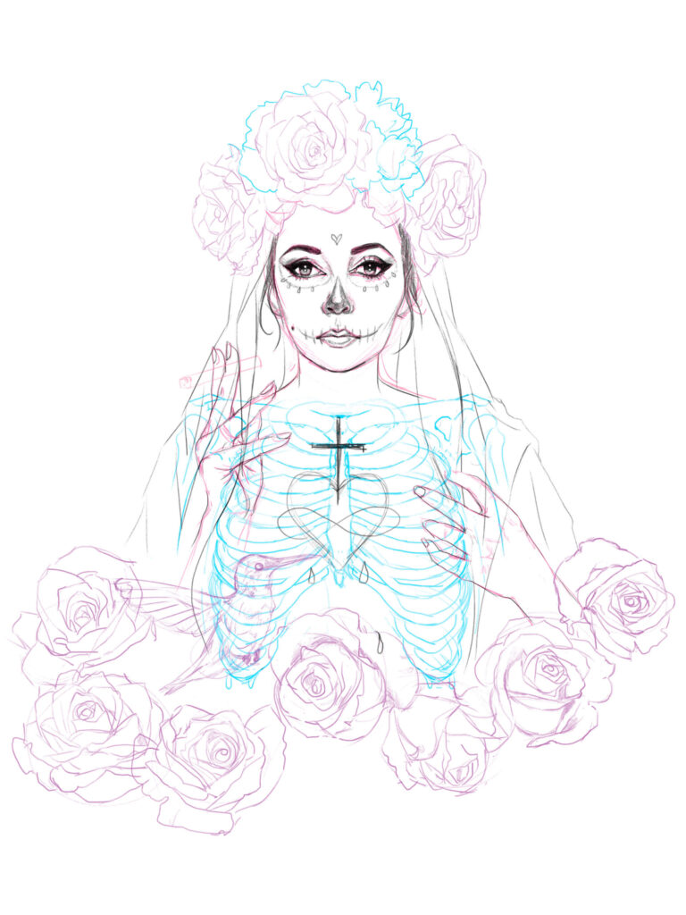
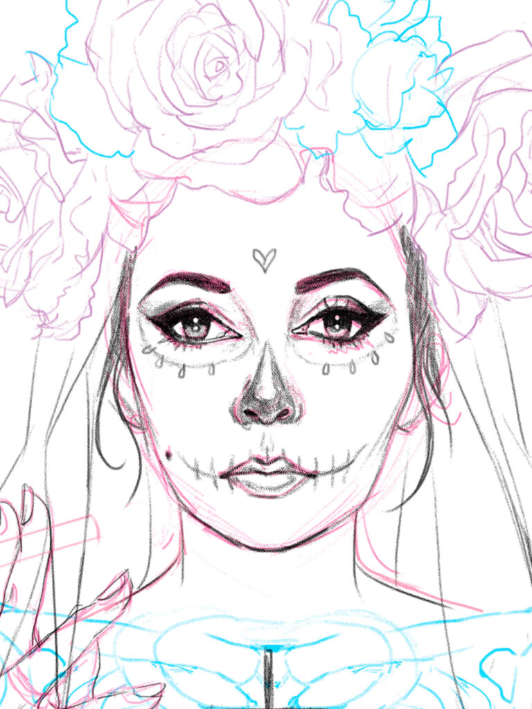
Drawing inspiration from the golden age of Hollywood, urban grunge, and depictions of Latin folk saints, I rough sketched a skeletal saint of my own design.
Created during one of my live-stream art sessions, Our Lady (of Los Angeles) took on many forms, before progressing to vectorization. Each element was sketched in a different color with minimal shading, to enhance visibility during the vectorization process, while maintaining consistency with my preferred style of rendering, grouping, and merging of elements throughout the graphic.
Vectorization
Designed on the ultimate time crunch, I chose to render this graphic in black and white for maximum contrast against the white instrument body. The plan was to create a single-color rub-on transfer for application to the instrument, making the bulk of this process the vectorization of the artwork itself.
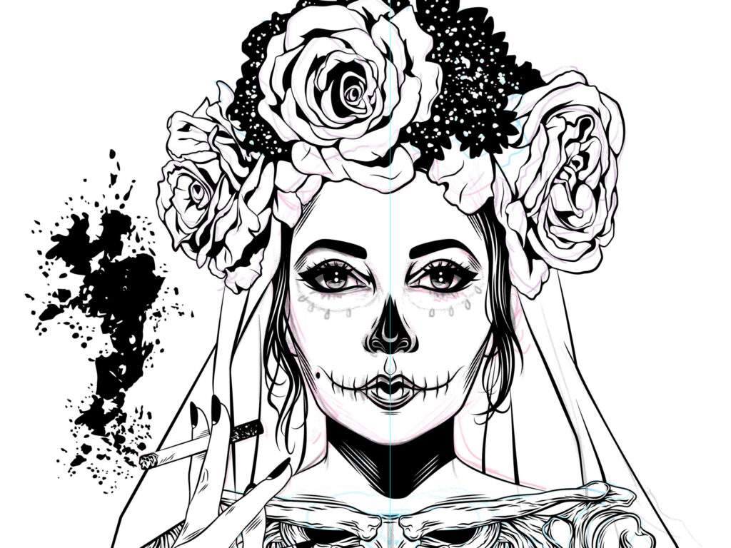
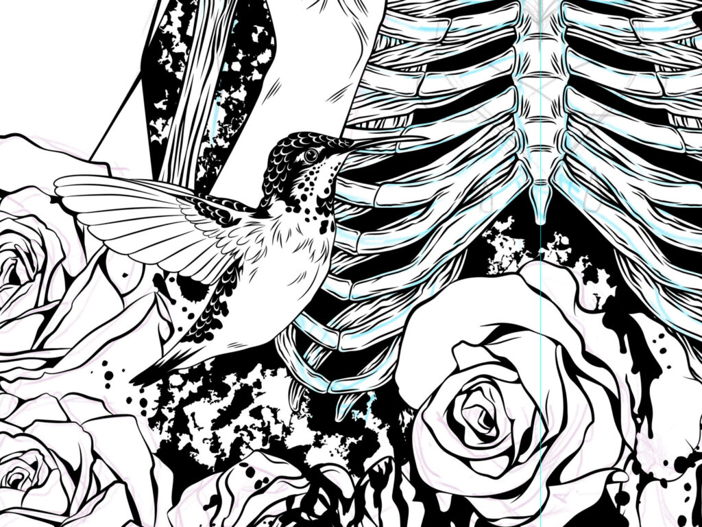
In addition to manually vectorizing the sketched design, I created a number of grunge textures for use in this graphic utilizing my own traditional watercolor brush strokes, ink spatters, and torn paper. Of the thirteen grunge elements created for this graphic, seven progressed to the final design.
Graphic Transfer
Once complete, I commissioned a rub-on transfer of the artwork from Platon Graphics, a commercial printing company based in Los Angeles. As this transfer type is applied right-side up to smooth surfaces, I was able to get a sense of the finished placement in real time, while adjusting the artwork on the guitar body for optimal alignment, before removing the backing paper and finally burnishing it onto the instrument body.

To learn more about the application of the graphic and how the instrument was completed, be sure to check out The White Dahlia Part I.

Photos of the completed guitar body can also be viewed here.
Reflection
Despite my experience as a vector illustrator, the graphic portion of this project was not without its challenges. At one point, I encountered an absolute nightmare of a situation, when it came to expanding and dividing overlapping elements of the graphic, resulting in hundreds of non-visible artifacts that had to be located, manually selected, and deleted from the document.
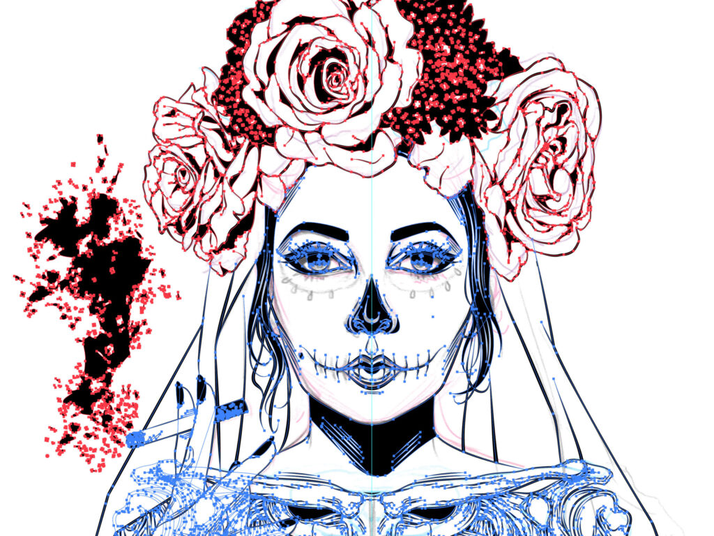
After an all-nighter, I was (thankfully) able to resolve the issue in a way that still allowed me to submit my graphic to the printer on time, arrange for a local pickup of the rub-on transfer before a national holiday, and finish the guitar in time for the exhibition.


Special thanks to Platon Graphics, for coordinating with me on such a tight deadline and creating a flawless rub-on transfer sheet of my artwork, for my instrument.
More music-minded creations, coming soon!